Samsung Card · Website Renewal · 2016–2018

Making a dense financial site easy to move through

Samsung Card's website carried complex, wide-ranging services — but a tangled information structure and unintuitive UI meant customers weren't finding or using the ones that mattered.

My roleUX strategy, IA & interaction design
ScopeMobile & desktop main site
Also ledUX governance for digital services
Business goal

Raise accessibility and per-service engagement.

Two targets drove the renewal: improve accessibility so customers actually use the services, and lift per-service conversion (CTR) to grow engagement. The UX strategy: a simplified information structure to raise CTR/CVR, personalised content to strengthen accessibility, and a mobile-first approach for a consistent experience across devices.

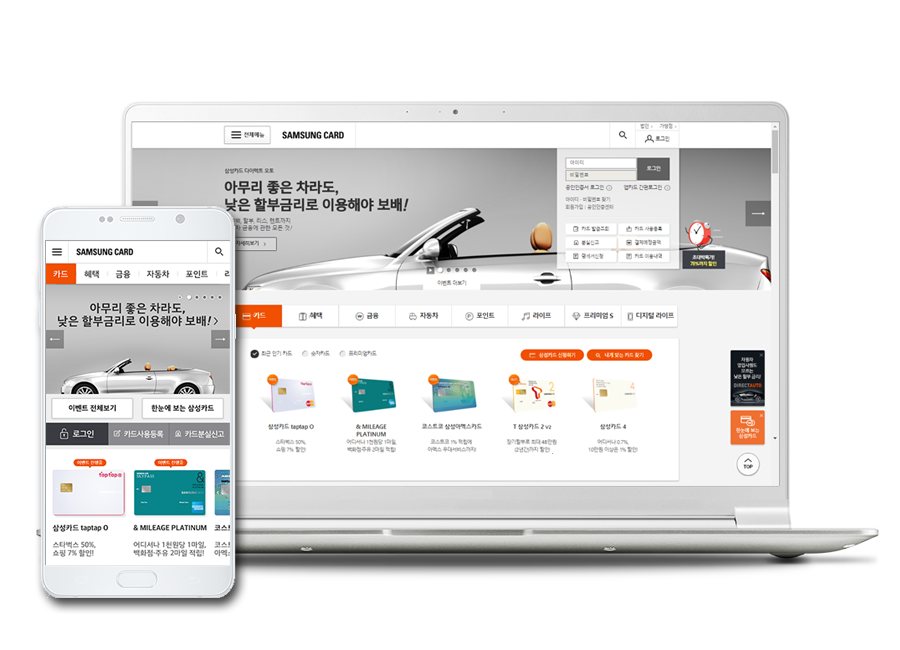
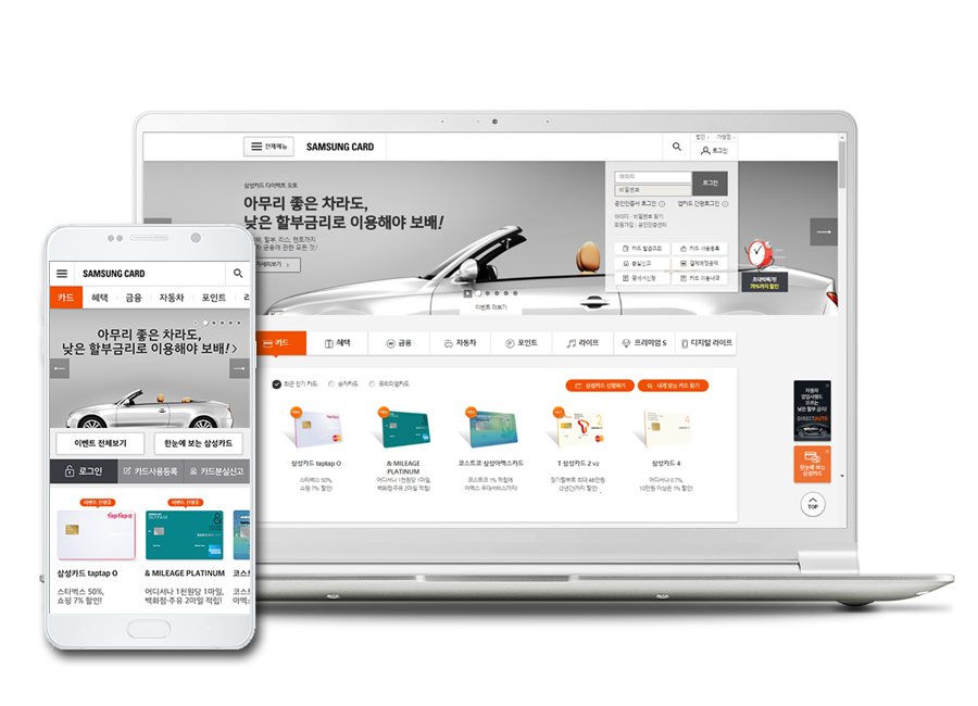
Samsung Card redesign — desktop and mobile
One consistent experience across mobile and desktop
Problem

Two reasons customers weren't engaging.

1Low CTR per service

Hard to navigate

A complex information structure and unintuitive UI meant users couldn't easily explore services, so per-service participation stayed low.

2Weak personalisation

One-size-fits-all

Too little tailored content and recommendation left customer satisfaction low — customer data wasn't being used to personalise the experience.

Hypothesis

Simplify the structure, then personalise it.

H1Clarity

Intuitive UI + simpler IA will raise participation

Simplifying a complex information structure and strengthening intuitiveness helps users find what they want, raising engagement.

H2Relevance

Personalised content will lift satisfaction & conversion

Tailored recommendations built on customer data encourage more active use of services.

UX direction

Four principles for the redesign.

Interaction / IA

One-click access

Cut the steps between a customer and the service they came for.

Design

Balanced module design

A consistent, well-proportioned module system across the page.

Content

Personalised content

Surface relevant offers and services using customer data.

Consistency

Device adaptation & brand identity

One coherent experience and identity across mobile and desktop.

Direction 01 · Interaction / IA

One-click access

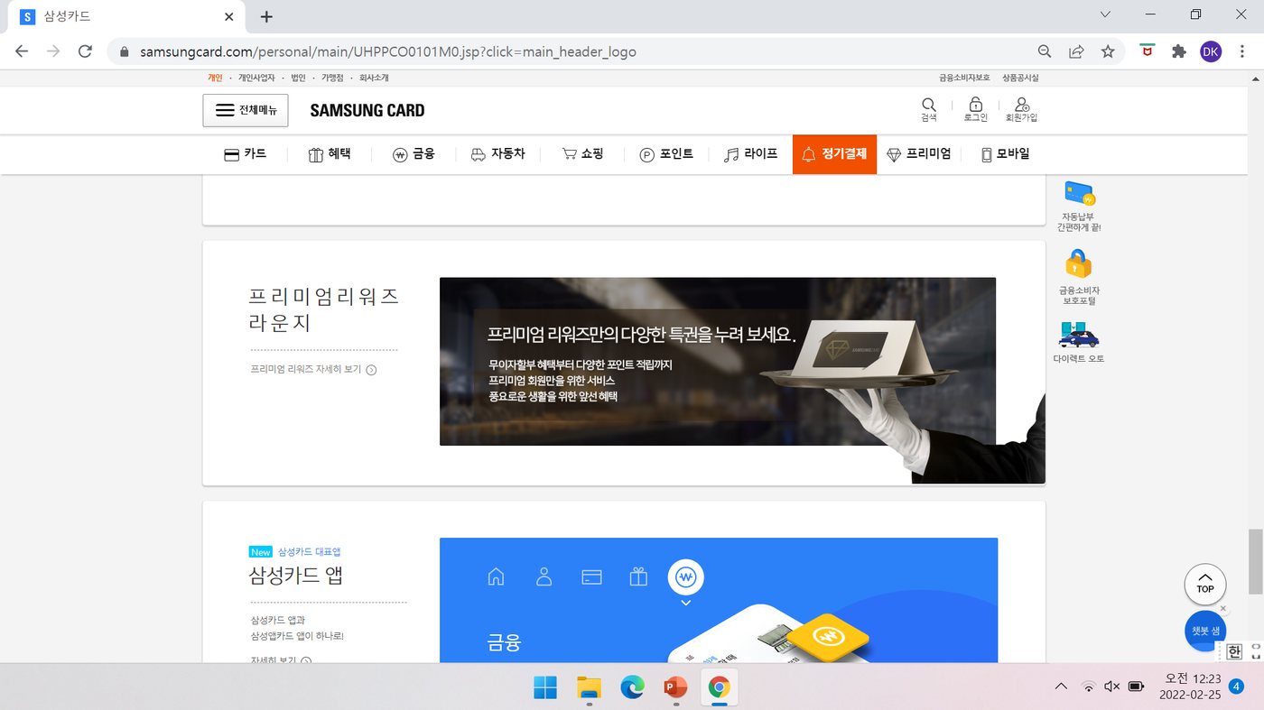
The main page was restructured so that high-value services sit one tap away. A simplified information structure and more intuitive UI let customers reach what they came for without hunting through menus.

One-click access main page
Key services surfaced directly on the landing page
+12%
Click-through rate (CTR)
2.5% → 2.8%
Direction 02 · Design

Balanced module design

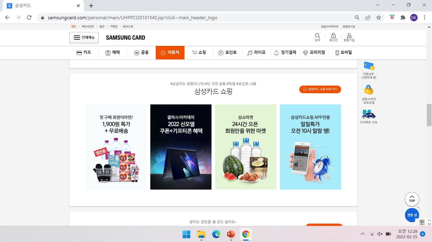
A consistent module system gives the page rhythm and hierarchy — wide-ranging content organised into well-proportioned blocks that scan cleanly, instead of a wall of competing links.

Balanced module design
Content organised into balanced, scannable modules
Direction 03 · Content

Personalised content

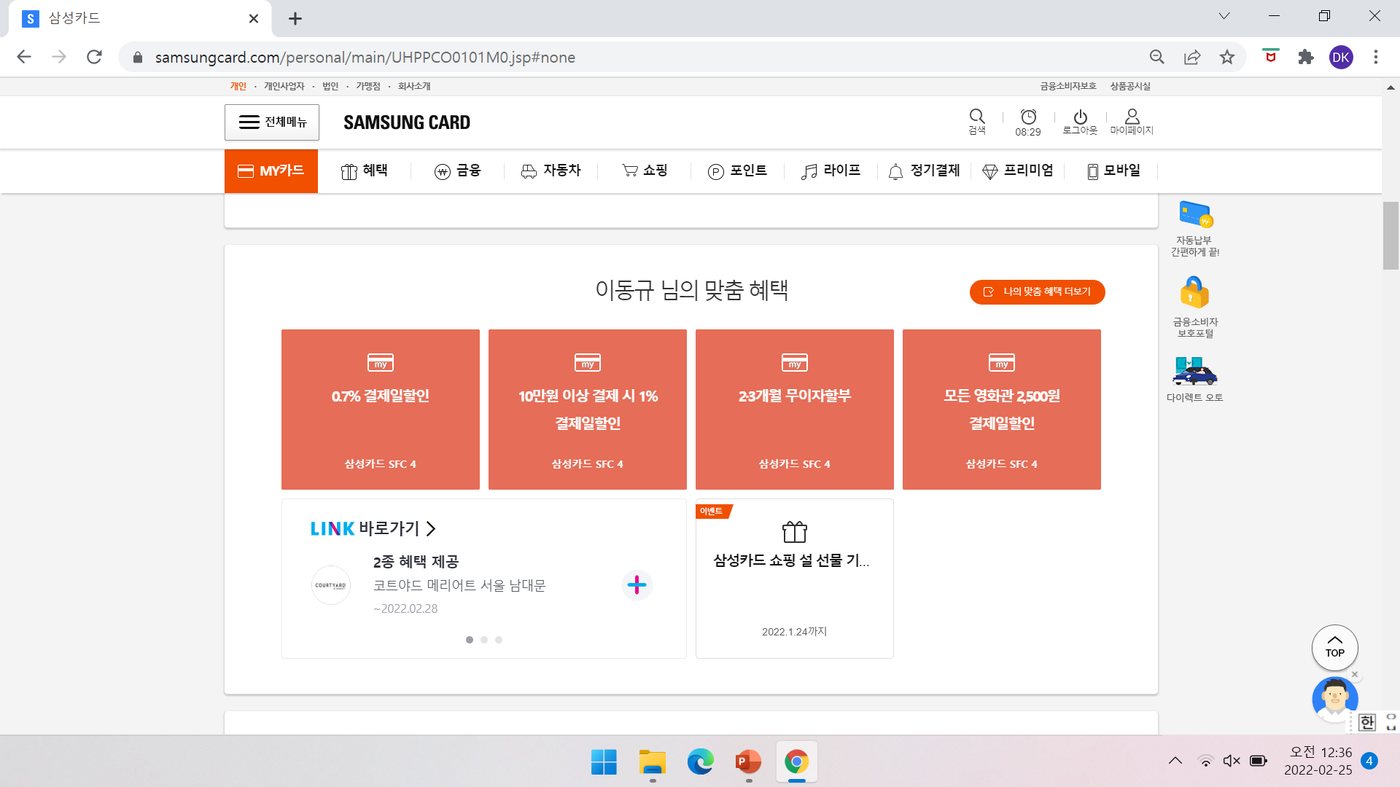
Using customer data, the site surfaces relevant offers and recommendations for each user. Personalised content raises both satisfaction and the likelihood a customer acts — the biggest single lever on conversion in this project.

Personalised content modules
Recommendations tailored to each customer
+25%
Conversion rate (CVR)
0.8% → 1.0%
Direction 04 · Consistency

Device adaptation & brand identity

The experience holds together across screens — a mobile-first approach that keeps layout, behaviour, and Samsung Card's brand identity consistent whether the customer arrives on a phone or a desktop.

Device adaptation
Consistent identity from mobile to desktop
Outcome

Measured lift across two directions.

+12%
Click-through — One-click access
2.5% → 2.8%
+25%
Conversion — Personalised content
0.8% → 1.0%